Unwelcome: The Cover
6/18/20261 min read
I am wild about my book cover, and I was very pleased to offer a bit of creative input into its design.
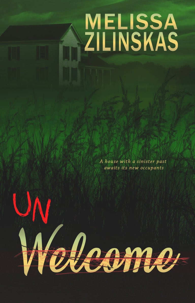
The depiction is simple, but effective. There are four elements: the ominous sky; the old farmhouse, its facade ever so slightly illuminated; a tagline, describing the scene; and the title, lurking beneath the shadows of the wheat.
My publisher designed the cover. The only part I can take (partial) credit for is the title. I had originally wanted a picture of a welcome mat, with the letters U and N scrawled in red in front of the word “welcome.” Alas, she wasn’t able to make this work as well as she’d wanted. But the finished design, with the word “welcome” (in a “welcome-mat font”) menacingly scratched over in red with the letters U and N preceding it, carries the same mood and message.
The story takes place in rural Kansas, and the dark outline of wheat dominates the setting. Aside from the script, the cover design was done almost entirely in shades of hazy green and black, lending a foreboding quality to the scene.
Within the wheat field is a tagline, revealing the start of the story in ten words: A house with a sinister past awaits its new occupants. And above that, beneath a portentous sky stands the farmhouse, slightly fading into the darkness.
I appreciate that my publisher was able to incorporate the key attributes of the story’s setting into the cover of Unwelcome, and I love that she did it in such a ghostly manner.